
A different kind of wealth brand.
Richer Means is dedicated to supporting individuals, families and wealth advisors build richer lives. The brand’s proposition – distilled into the strapline Embracing Money, Mind and Self – treats financial wellbeing as inseparable from psychological wellbeing and personal identity.
That’s a more ambitious position than most players in the space are willing to take, and it demanded an identity that felt premium without feeling cold, and confident without feeling corporate.
The mark.
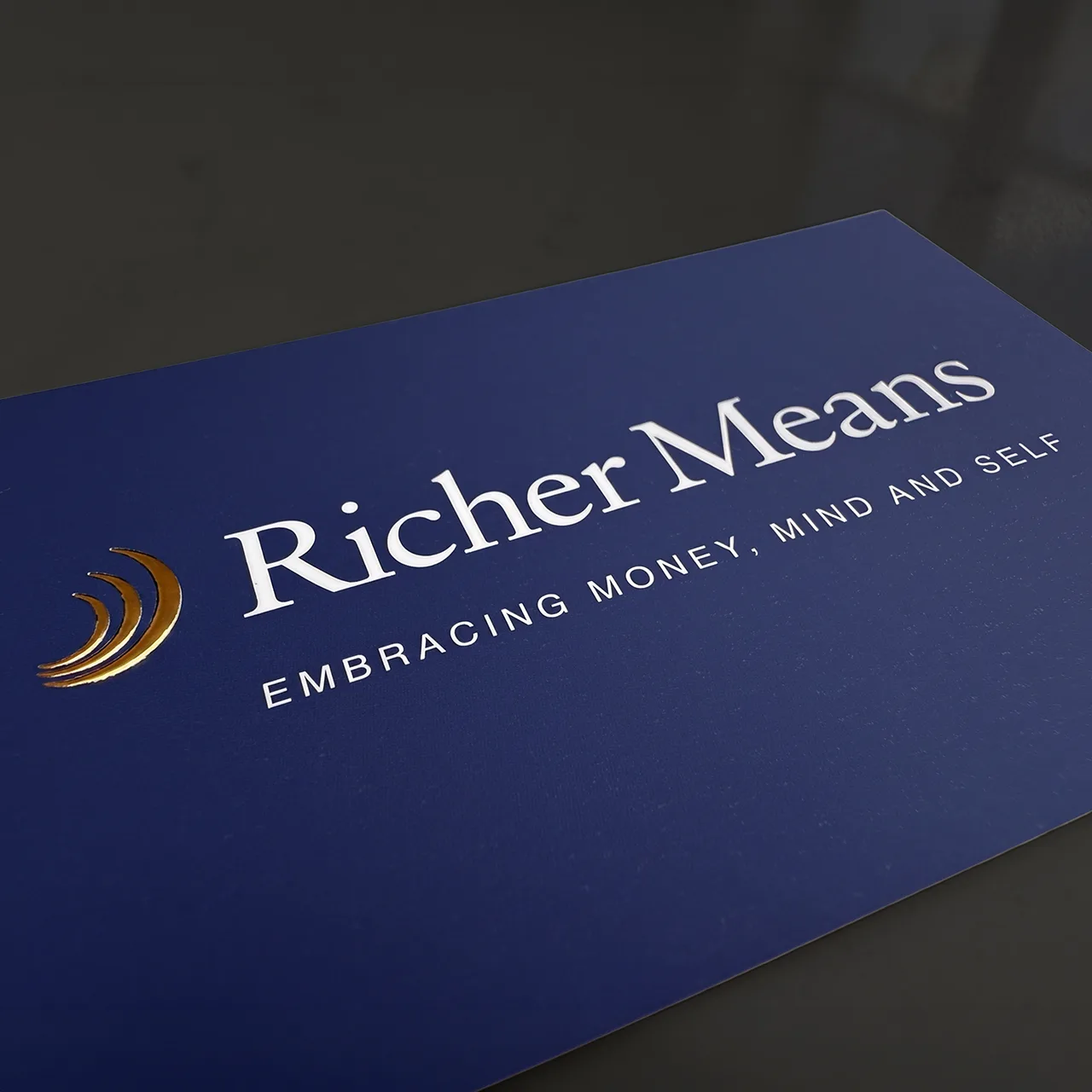
At the centre of the identity is an icon of three overlapping crescents, rendered in gold and set against a deep blue field. It’s designed to suggest movement, layering and balance – money, mind and self, folding into one continuous form. The crescents work as a standalone device as readily as they sit beside the wordmark, giving the brand a flexible signifier that scales well.
The wordmark itself uses a classic serif, chosen deliberately to counterbalance the more contemporary iconography — a nod to trust and permanence sitting alongside a mark that feels current. Rendered in gold against a deep blue, it’s built to hold its own on a page rather than compete for attention.
Building a brand.
Blue and gold form the primary palette, joined by a secondary palette of dark blue, mid blue, teal, peach and yellow to give the brand room to breathe across different contexts.
A clean, highly legible typeface built for a digital-first brand, juxtaposed with a serif typeface gives Richer Means a voice that can move between the functional and the reflective.

The website.
The website brings the identity to life across a full digital experience, translating the brand’s editorial sensibility into a site structure built to inform as much as convert. It’s the first proper outing for the identity at scale, and the place where the balance between clarity and warmth that defines the brand gets its clearest test.
Built to last.
It’s a rare brief that asks an agency to hold two ideas – financial rigour and emotional intelligence – in balance. Richer Means is a brand built for people who think about money differently, and we think the identity now reflects that.
View the website at richermeans.com, and as ever, get in touch if you’re working on something that needs the same level of care.


